Cargo X
On the road, in the branch, at the door: the new colour of speed.
The cargo sector is full of look-alike colours and repeated promises. As Türkiye’s new-generation cargo company, Cargo X wanted to be recognised at first glance in that crowd. So we built it not a logo, but an identity system in motion, seen thousands of times a day on the road, in the branch and in people’s hands.
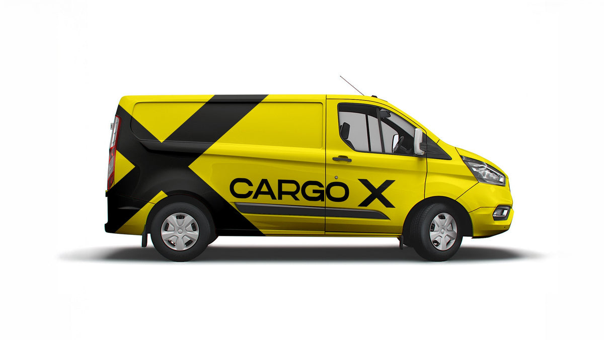
We deliberately walked away from the sector’s palette.
A cargo brand is seen most not in ads, but on the road: in traffic, on a busy street, at an apartment door. So our first question was simple: when Cargo X is seen for a split second, what should people remember?
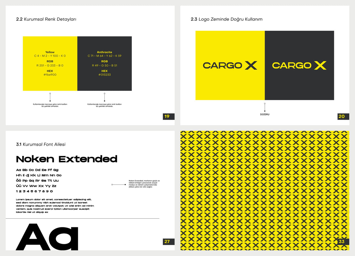
The answer was a high-contrast presence far from the sector’s usual reds and navies. Yellow, the colour of speed, energy and visibility, became the brand’s main voice. Anthracite became the ground that balances that energy and carries trust and professionalism.

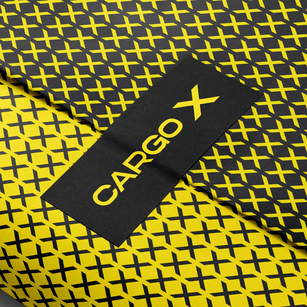
The “X” is not a letter. It is crossing roads, places reached, a target marked.
We put the X of the logo at the centre of the brand’s story. Every shipment is a road from one point to another; every delivery is an X marked on the map.
We turned that symbol into a pattern system that can repeat endlessly. Cargo X became recognisable by its pattern even when the logo is out of sight: on the corner of a bag, on a van door, on a branch window.
Not one-off designs, but a system that works with the same clarity on every surface.
We brought the rules for colour, pattern, typography and layout together in one identity guide. When a new branch opens, a new vehicle joins the fleet or a new campaign starts, the brand takes the stage with the same strength every time.
Every surface the brand touches is part of the sale.
- 01Branches
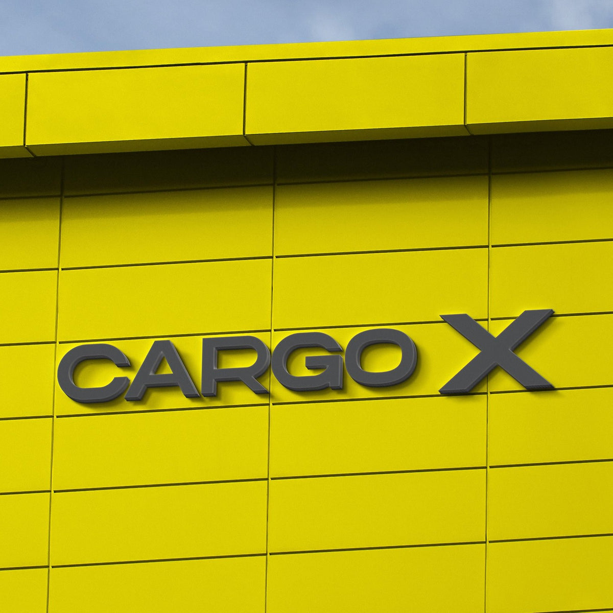
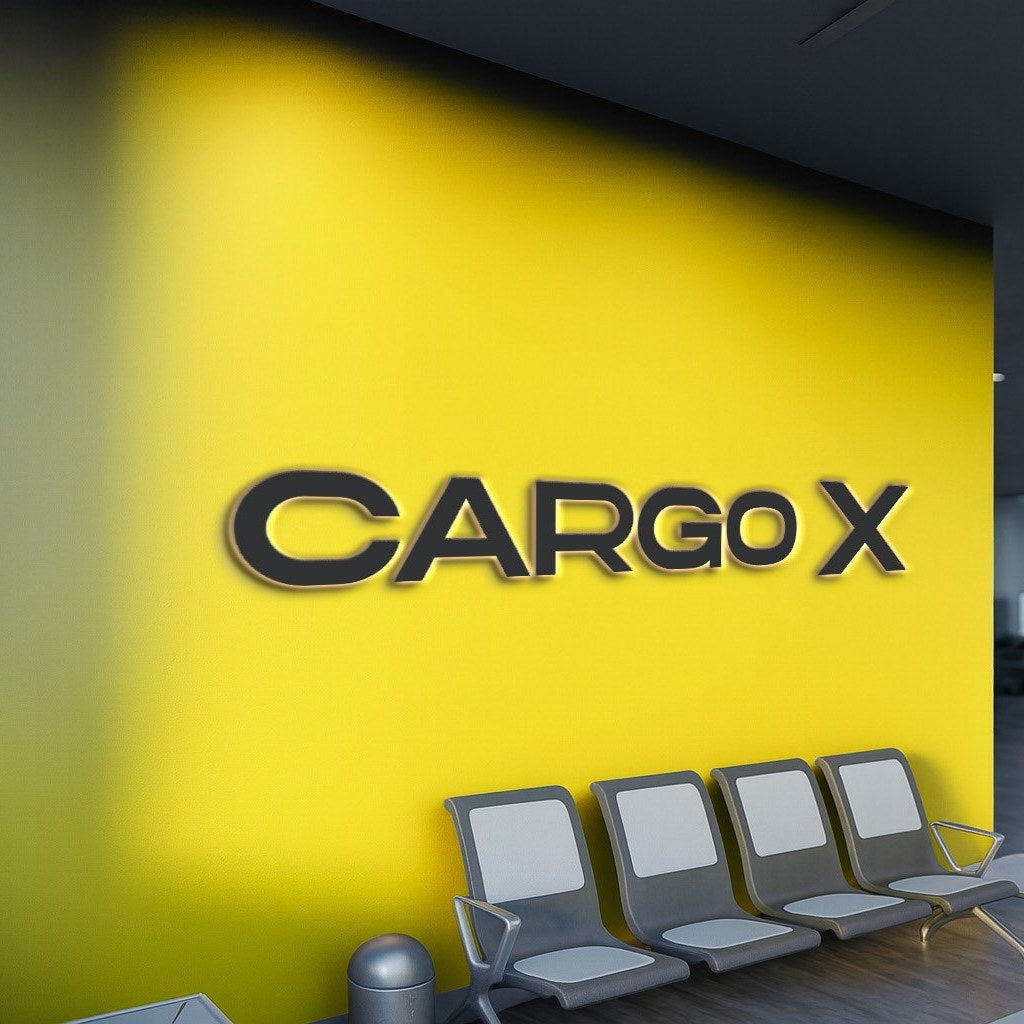
From headquarters to the smallest branch, façade, interior, wayfinding and reception speak one system.
- 02Fleet
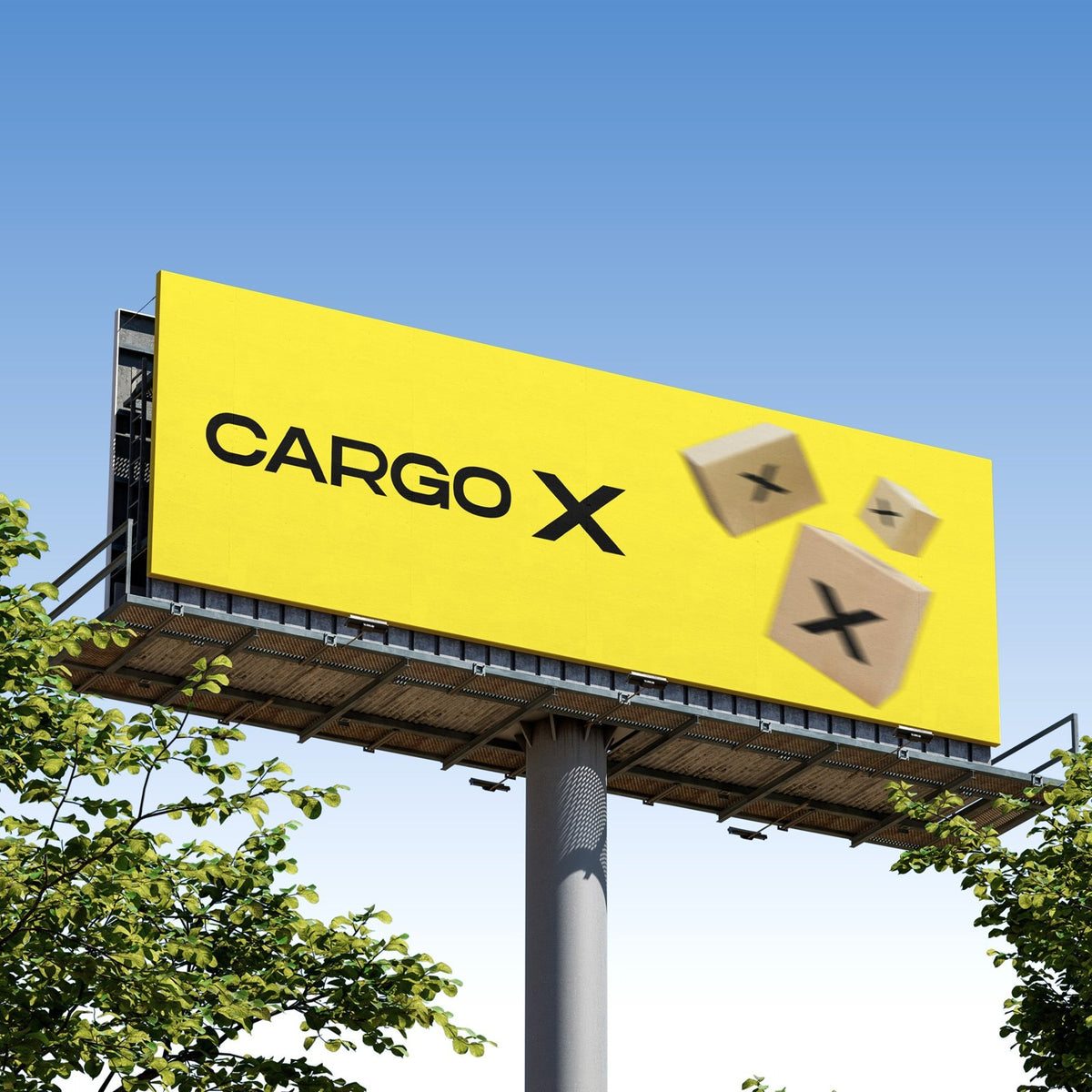
Every vehicle is a moving billboard. The contrast of yellow and anthracite stays legible from far away on the motorway.
- 03Campaigns
A communication set that tells the promise of speed with clear, direct messages at launch and in every campaign period.
- 04Everything in print
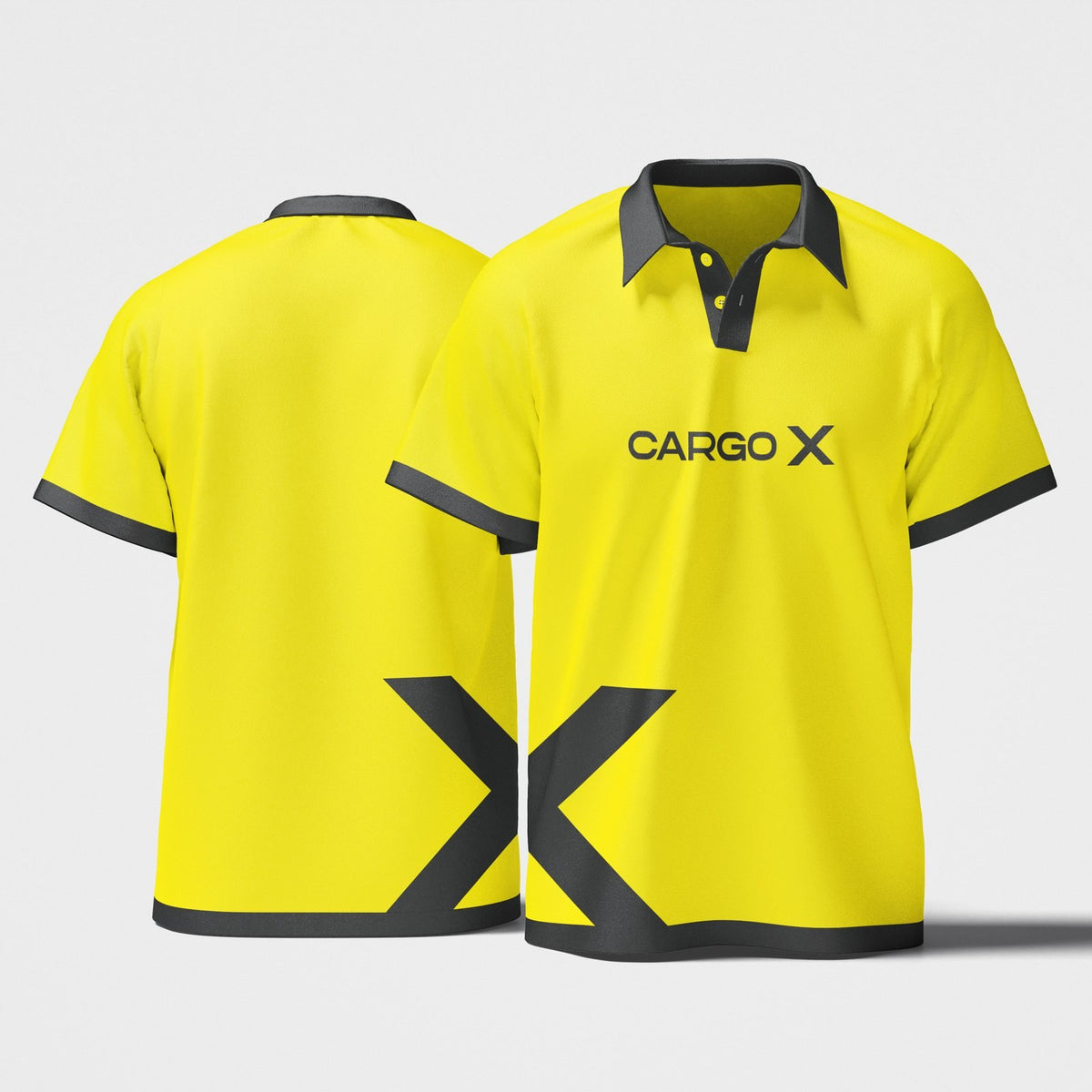
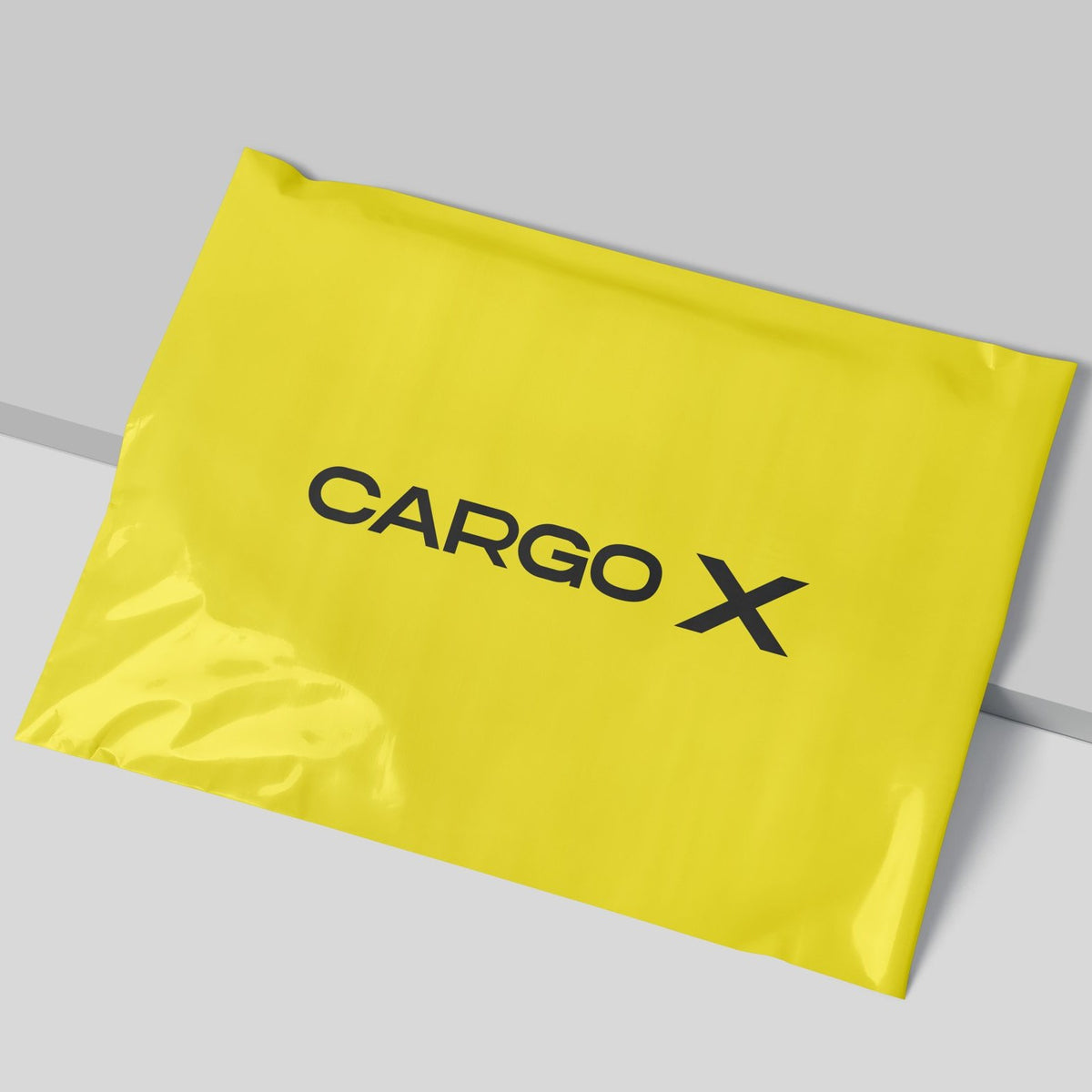
From cargo bags and labels to shipping documents and staff cards, the same standard everywhere.
“Cargo X is no longer just a cargo company; it is a brand recognised in the rhythm of the city.”