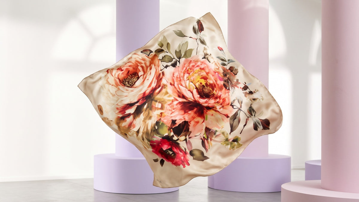
Luzia Diamond
A brand that shines without raising its voice.
Jewellery is a world of established names and familiar codes. Luzia Diamond had to bring fresh air into it without giving up an ounce of trust or prestige. We designed its logo and corporate identity around one idea: real brilliance doesn’t announce itself. It simply catches the light.
Luzia
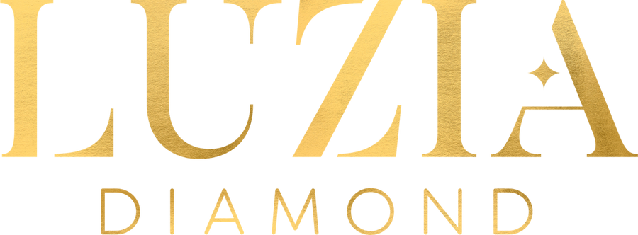
- In jewellery, everyone wants to shine louder.
- For Luzia, we chose silence.
- A high-contrast serif and one small star.
- A name that shines without raising its voice.
Every letter, worked like a stone.
The letters are drawn in a high-contrast stencil serif: the fine breaks in their strokes recall the facets of a diamond. Inside the A, a small four-pointed star catches the light. It’s the logo’s only ornament, and the whole identity grows out of it.
- 01Letters
A stencil serif
- 02Star
A glint in the A
- 03Diamond
Quiet and spaced
A diamond has no light of its own.
It shines only when light finds it. So we’ve left the room dark. Carry the light yourself.

One emerald, four golds.
Deep emerald holds the silence. Four tones of gold, from the lightest to the deepest, carry the light across surfaces.
From a business card to a storefront, the same quiet.
The identity was built to work at every scale. On paper it’s gold foil, on a box it’s touch, on a facade it’s light. Wherever you meet it, it says the same thing without raising its voice. The star leaves the logo too, and becomes a pattern that wraps every gift.
- 01Stationery
Cards, letterhead, envelopes
- 02Packaging
Boxes, bags, display cards
- 03Pattern
The star as a surface
Everything the light touches.
A walk through the brand’s touchpoints.


A logo also needs to be protected.
A diamond is cut once. A logo is used a thousand times, by many hands. So the identity comes with a guide that defines what can’t be touched. Choose a rule.


“A brand that shines without raising its voice.”