
Latifa
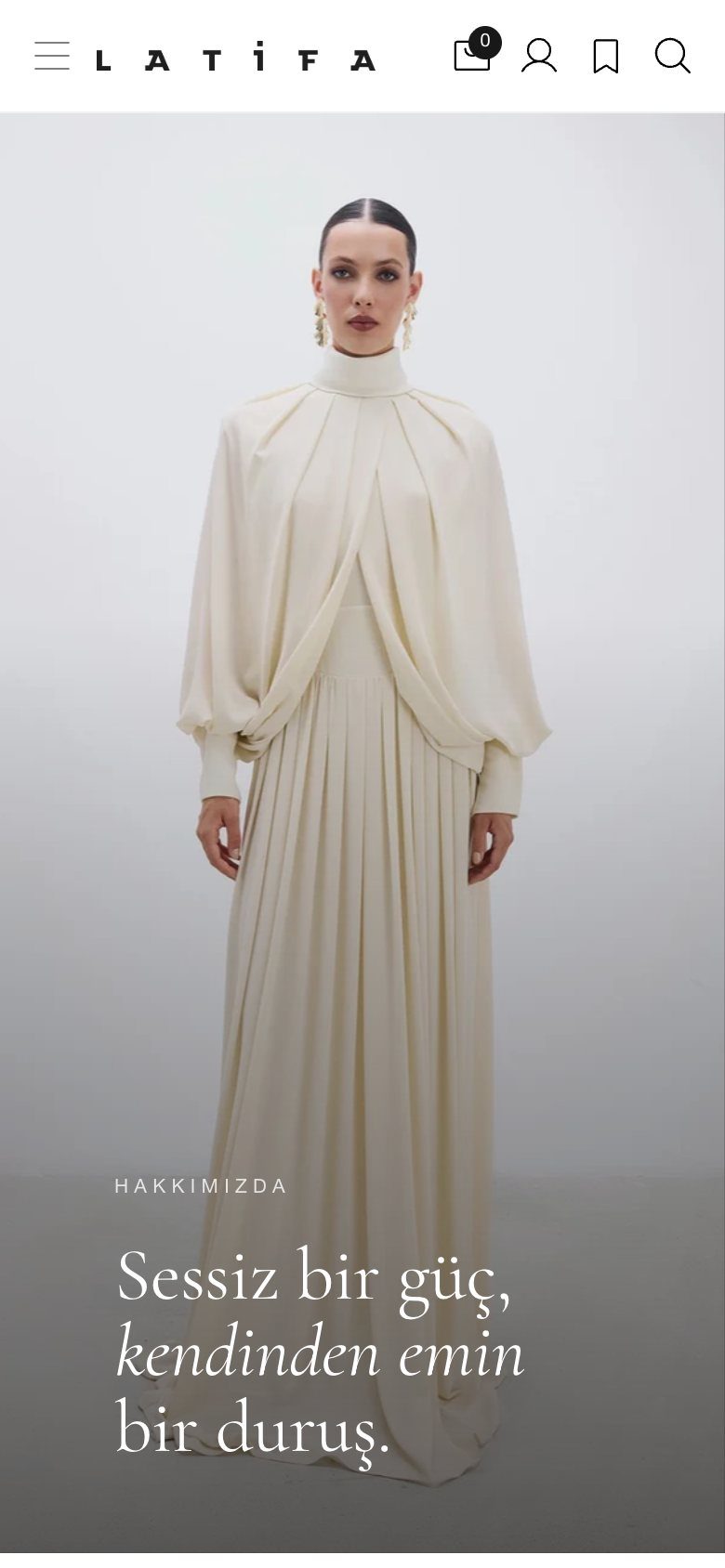
Quiet strength, now online. A store that answers before you ask.
Latifa designs for the moments when a woman feels most herself: pieces far from showy, never ordinary. A brand this restrained can’t be sold with noise. We built its online store end to end around that same restraint: a calm, editorial experience on the surface, and beneath it a system that resolves every hesitation that stands between a woman and a dress.
Luxury is what you take away.
Most fashion stores shout: banners, countdowns, pop-ups. Latifa’s voice is the opposite: “quiet strength”. So we set a rule for every screen. The garment comes first, and the interface steps aside until it’s needed.
Calm on the surface, though, doesn’t mean thin underneath. Everything a woman might need to decide is there. It just appears at the moment she needs it.
- 01Hierarchy
The garment first
- 02Rhythm
Editorial pacing
- 03Timing
Information at the moment of need


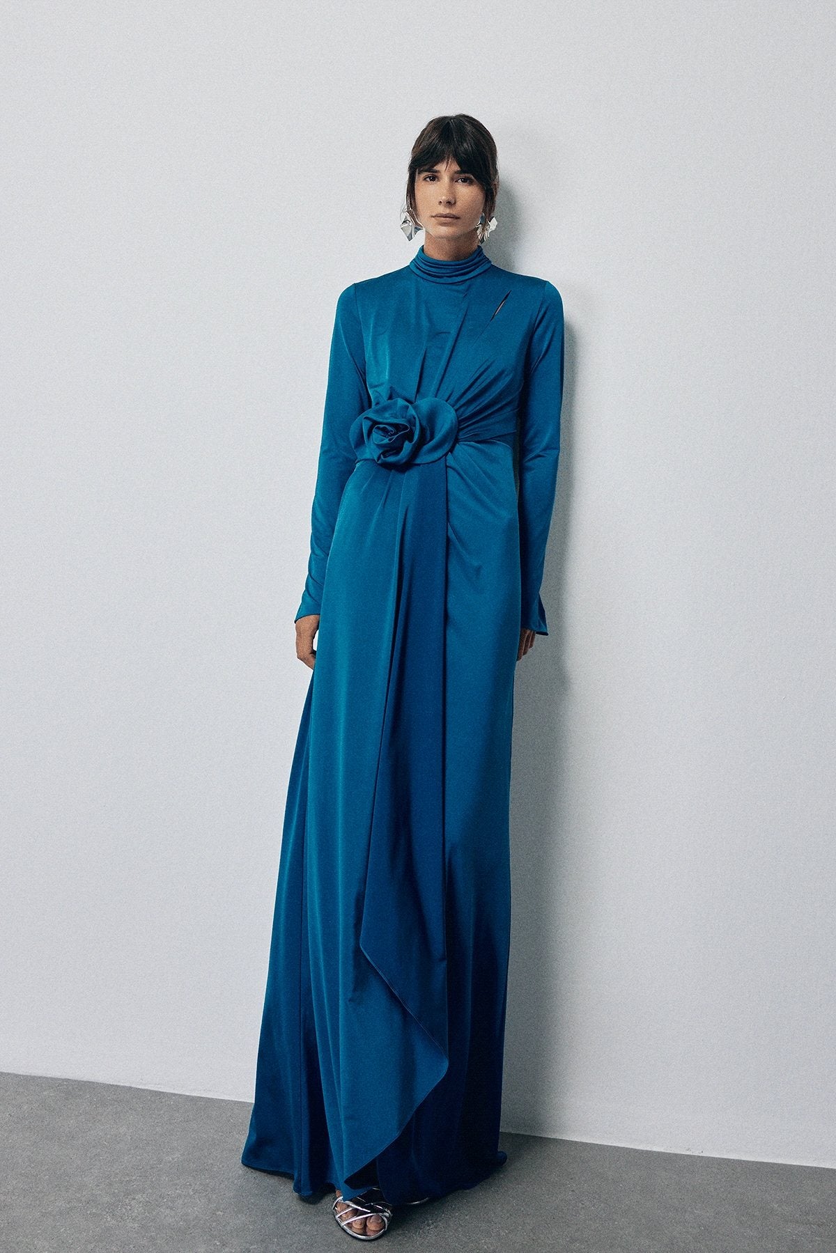
A store you read like a magazine.
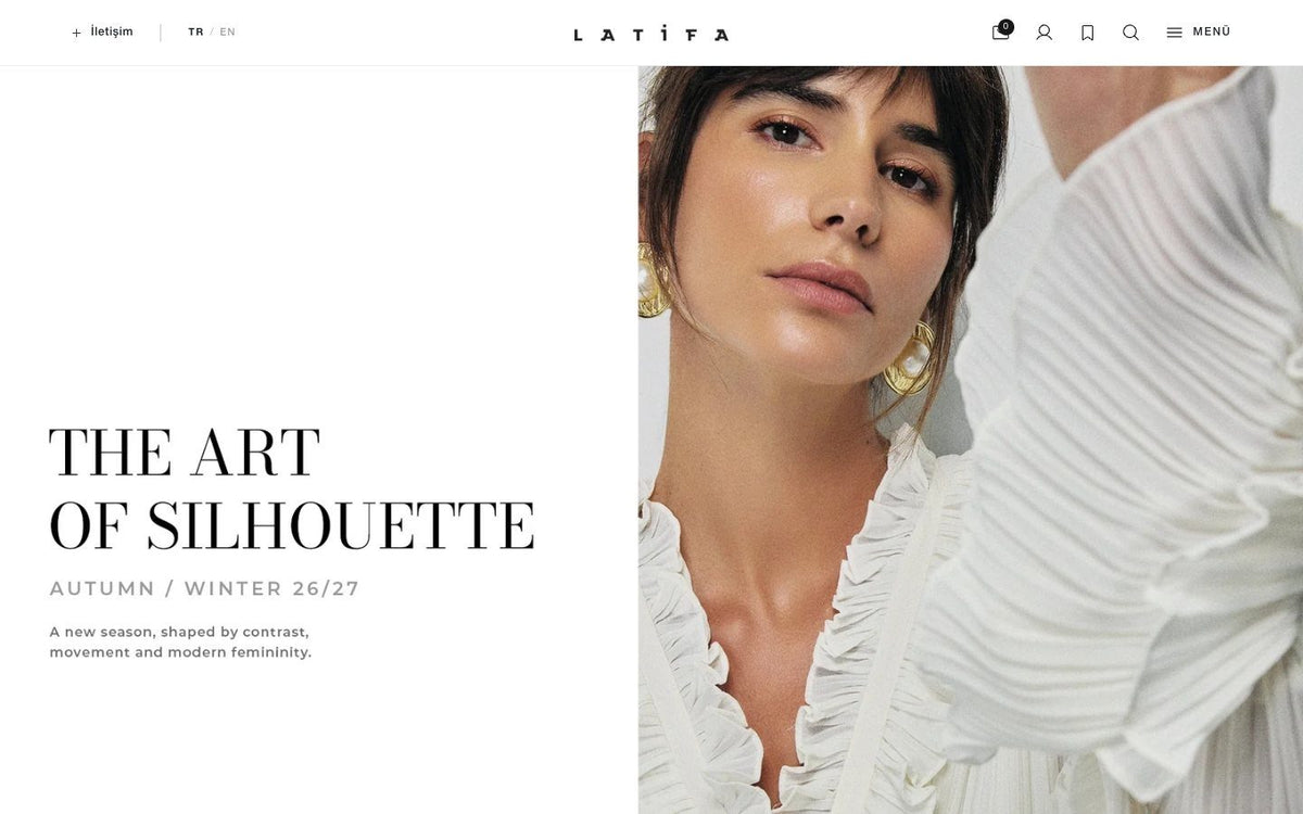
We planned, designed and built the site end to end: architecture, interface, product pages, lookbook and every state in between, in Turkish and English. The home page moves like a magazine: a large image, a short sentence, a small selection, then silence again. Selling happens between the pages, never on top of them.
Quiet at every scroll.
Scroll and walk through the home page, on desktop and on the phone.
- Architecture
- Interface design
- Product system
- Lookbook
- TR & EN
- Mobile first


From a first glance to a decision.
Choose a page and see what it’s there to do.




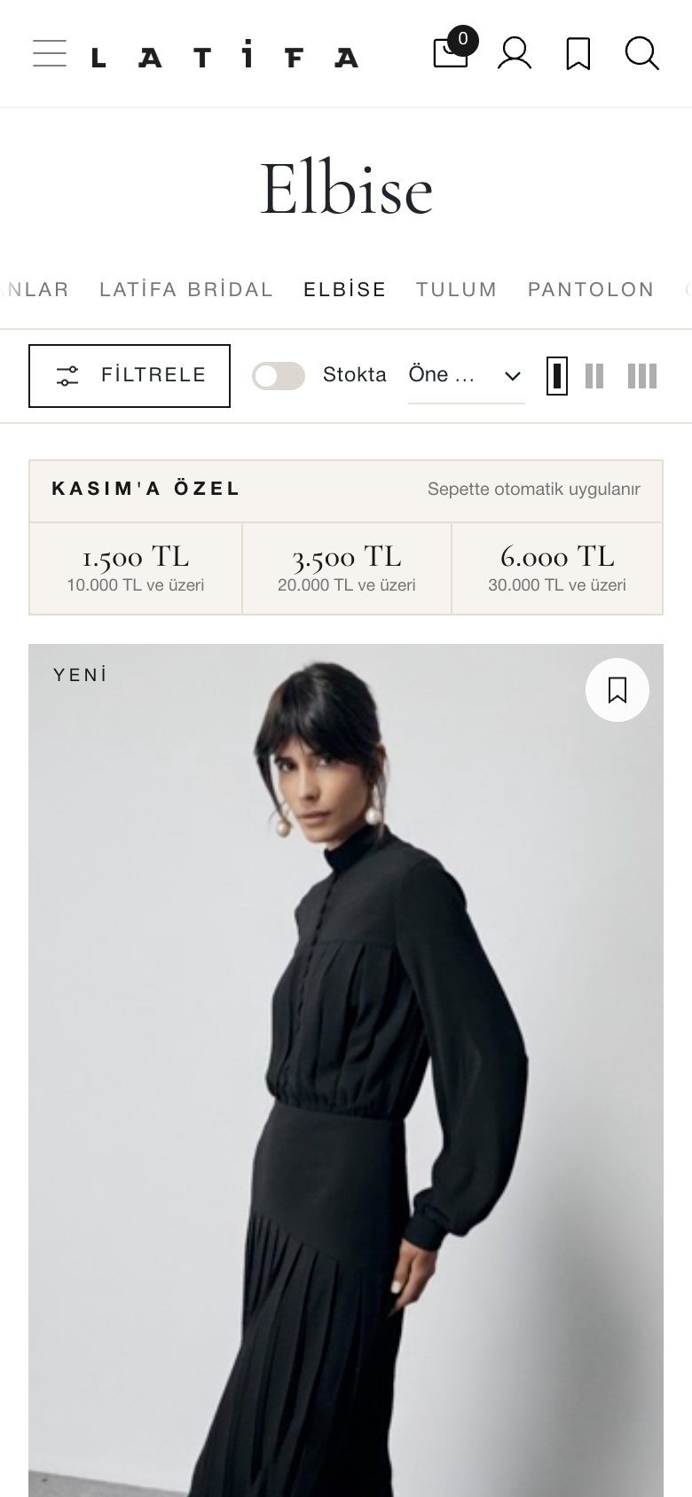


We designed for hesitation, not for clicks.
A dress at this level is rarely bought on impulse. It’s considered: for a day, a body, an occasion. So we didn’t ask how to make her click faster. We asked what stops her, and removed those moments one by one.
Six questions a woman asks herself before buying a dress.
In a fitting room these answer themselves. Online, every unanswered one is a lost sale. So we mapped them, and gave each its own answer at the moment it arises. Choose a question.


One page, seven decisions.
The order of a product page is the order of a woman’s thoughts. Choose a piece, scroll, and follow the page from the first look to the last detail. Each piece brings its own colour to the stage.


Elegance is also how it responds.
Real recordings from the live site on a phone. Each interaction is calm, clear and never pulls her away from the piece she’s looking at.
-
Size finderEnter your measurements, get a recommended size.
-
Buying from anywhereThe button follows as you read, and size opens in a panel.
-
Size on the cardFrom the collection to the basket, without opening the product.
-
Completing the lookA second piece opens on top of the page; she never loses her place.
-
The basketA clear confirmation, a benefit and a next suggestion.
-
MenuCollections first, categories second. Quiet even at its fullest.


“A store that speaks as quietly as the brand, and answers everything.”

