Fulya Kebap
The happiest way to say kebab.
Fulya Kebap is a kebab, pide and lahmacun house in Fulya, Istanbul. On a street with a kebab house on every corner, we gave it something the others don’t have: a character. We wrote her story, drew a logo that hugs her name, and carried that voice onto the flyer.
First, we wrote a character.
To stand apart on a street full of kebab houses, we started not with a logo but with a person: a cheerful gourmet in her mid-thirties, short hair, a huge smile and an endless love of kebab. Adana, Urfa or İskender with plenty of butter? For her there is no single answer; she loves each with its own passion. The brand’s voice, colour and attitude were born from her.
- 01Character
A cheerful kebab-loving gourmet
- 02Weakness
A perfectly cooked dürüm
- 03Line
The happiest way to say kebab
anatomy of the logo
Five blocks, two hands, one hug.
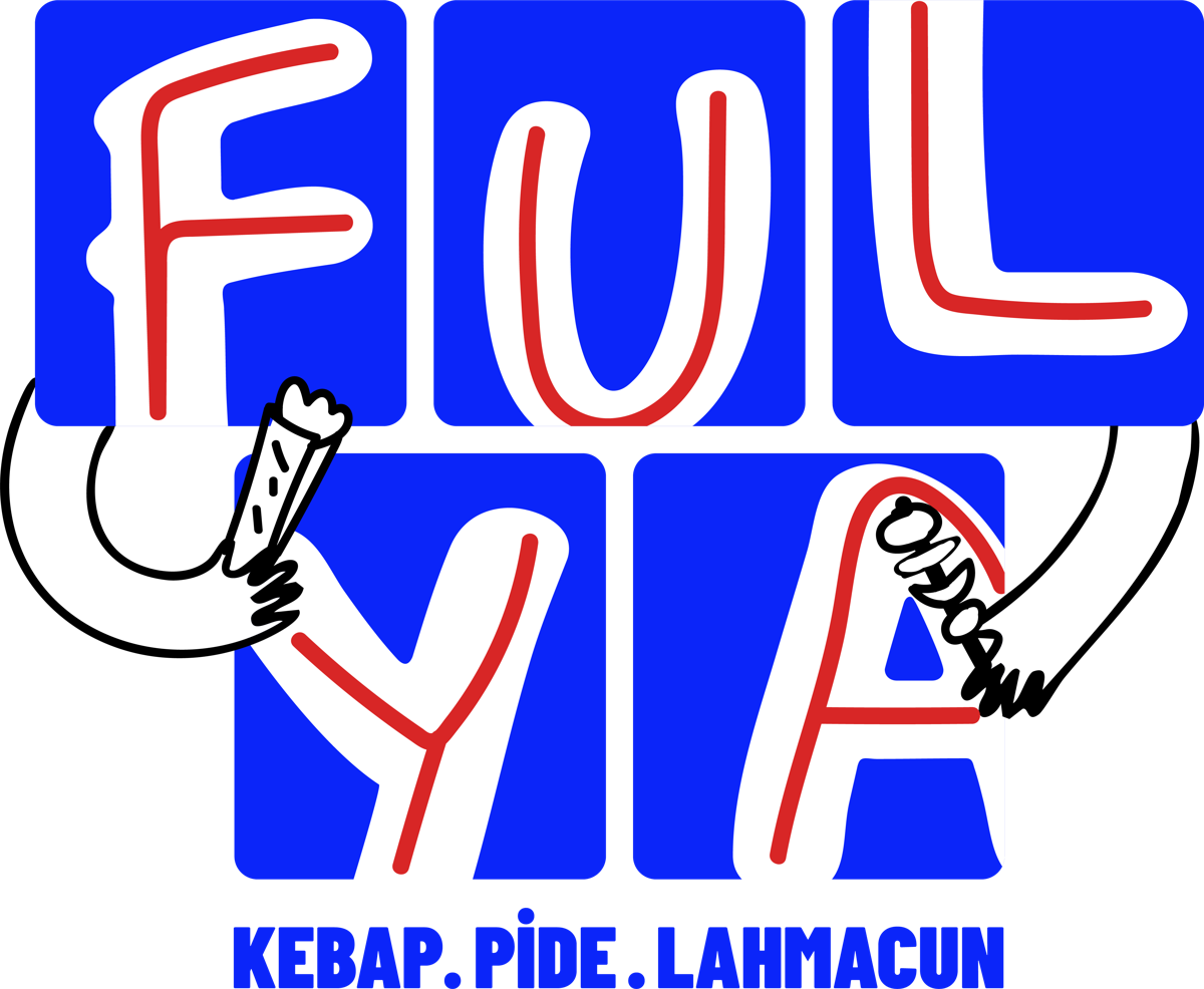
-
01
Five blue blocks
They read like a shop sign, even from across the street.
-
02
The red inline
The glow of the embers running through the letters.
-
03
A dürüm in the left hand
Fulya’s greatest weakness.
-
04
A skewer in the right hand
Adana or Urfa? Both.
-
05
Arms around the name
A big hug for everyone who walks in.
Not just another kebab house: a character.
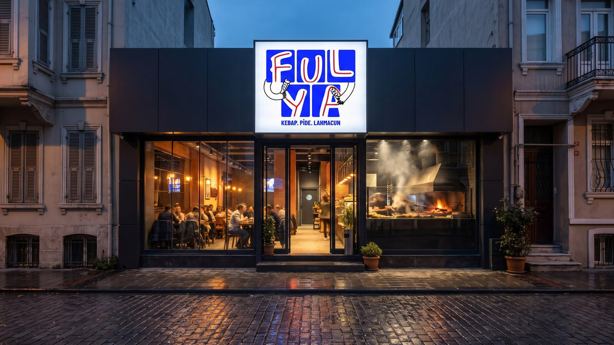
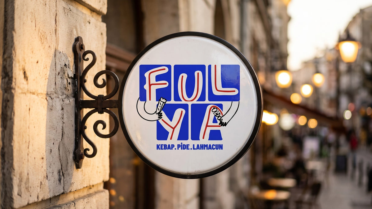
A logo you can read from across the street.
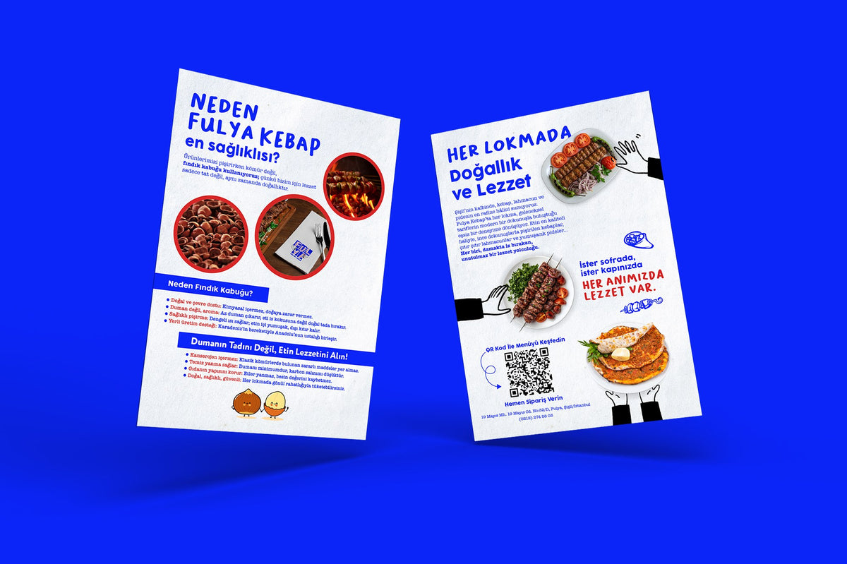
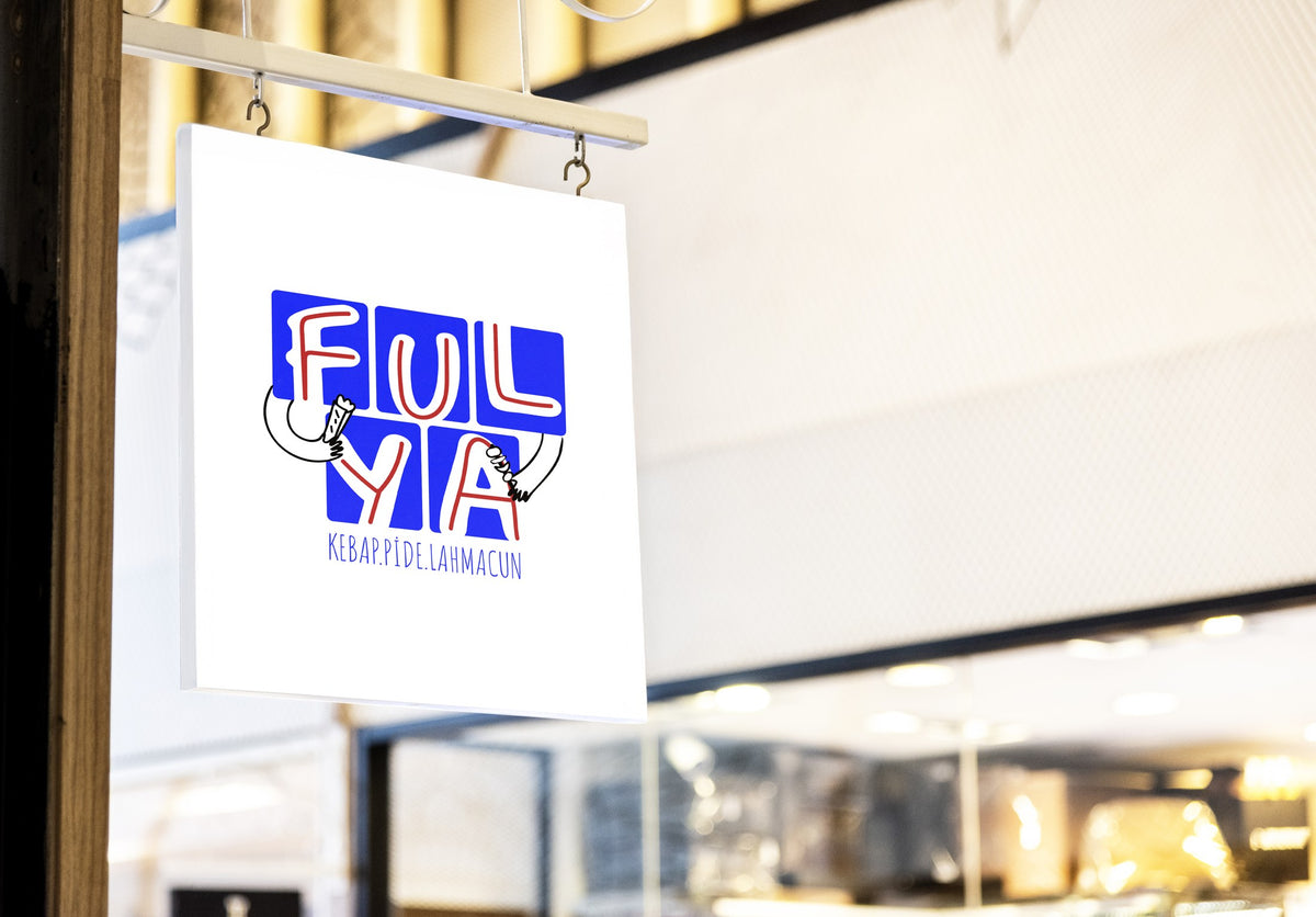
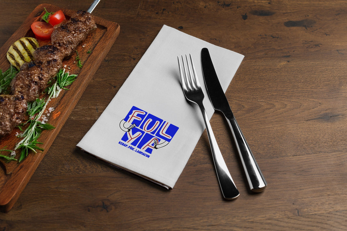
The block structure keeps the logo legible at every scale: on a sign from across the street, on a napkin from across the table. We built the flyer in the same language: blue headlines, red accents and Fulya’s hands, a page that tells the story of meat grilled over hazelnut shells, and a QR code that leads to the menu.
- 01Sign
Blocks that read from afar
- 02Table
Napkin and service
- 03Flyer
A5, two sides
“Not just another kebab house: a character.”